


Unlocking Pigee's Growth via An Application Portal Redesign.
Unlocking Pigee's Growth via An Application Portal Redesign.

Pigee
Pigee
At a Glance
At a Glance
Over eight weeks, I led an end-to-end redesign of Pigee’s salesperson application portal, starting with user interviews that revealed frustration and confusion in the 11-step flow. I analyzed competitor onboarding patterns, synthesized insights into user personas, and iterated prototypes with progressive disclosure, progress indicators, and clearer instructions. The final design streamlined the flow to 5 steps and gave Pigee a scalable system to onboard new salespeople with confidence.
Over eight weeks, I led an end-to-end redesign of Pigee’s salesperson application portal, starting with user interviews that revealed frustration and confusion in the 11-step flow. I analyzed competitor onboarding patterns, synthesized insights into user personas, and iterated prototypes with progressive disclosure, progress indicators, and clearer instructions. The final design streamlined the flow to 5 steps and gave Pigee a scalable system to onboard new salespeople with confidence.
8 weeks
Timeline: 8 weeks
8 weeks
My Role:
Product design intern and researcher.
1 Product Designer (Me!)
1 Project Manager (CEO)
2 Developers
My Role:
My Role: Product Designer
My Role: Product Designer
My Role:
Product Designer
Product Designer
1 Product Designer (Me!)
1 Product Designer (Me!)
1 Product Designer (Me!)
2 Developers
1 Project Manager (CEO)
1 Project Manager (CEO)
2 Business Strategists
Results:
Results:
5
minutes saved on the average application process based on 8 usability tests
44%
decrease in reported test user frustration
5
minutes saved on the average application process based on 8 usability tests
5
5
minutes saved on the average application process based on 8 usability tests
minutes saved on the average application process based on 8 usability tests
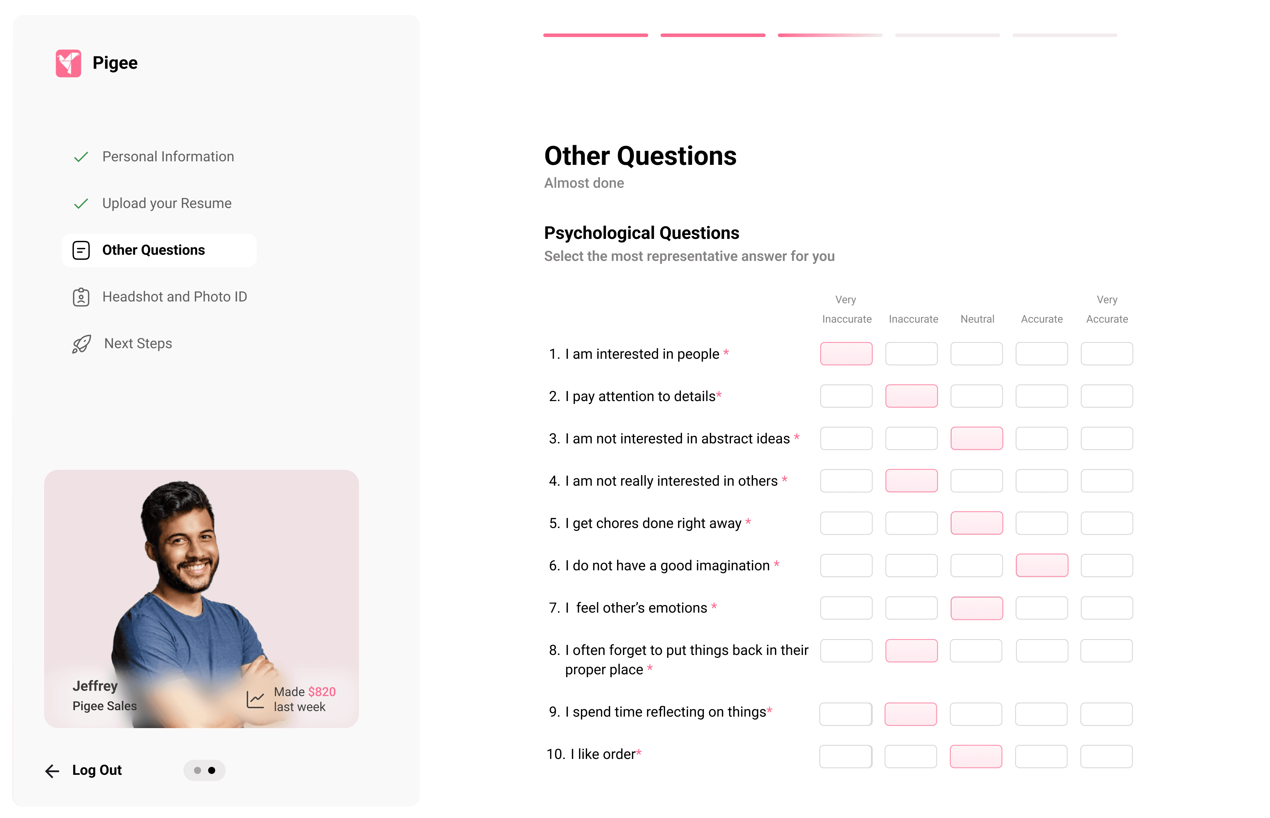
PROBLEM
PROBLEM
The Existing Application Process
Was Long and Confusing For Users.
The Existing Application Process Was Long and Confusing For Users.
The Existing Application Process
Was Long and Confusing For Users.
The convoluted application process was made clear by mapping out the user flow for applicants. The lack of instructions on these steps creates a frustrating experience for potential applicants, which decreases their desire to apply. This frustrating experience clearly was limiting Pigee's growth potential for its sales team and, therefore, reduced the adoption of its services.
The convoluted application process was made clear by mapping out the user flow for applicants. The lack of instructions on these steps creates a frustrating experience for potential applicants, which decreases their desire to apply. This frustrating experience clearly was limiting Pigee's growth potential for its sales team and, therefore, reduced the adoption of its services.
11 Steps
1 Application

11 Steps
1 Application
11 Steps
1 Application
RESEARCH
RESEARCH
Uncovering the Friction in Pigee's Application Experience.
Uncovering the Friction in Pigee's Application Experience.
Secondary Research→
I reviewed several papers on applicant processes and questions, as well as analyzed onboarding processes for new employees on other platforms (such as Uber). My research highlighted that progressive disclosure reduces cognitive overload, progress indicators enhance user motivation, and personalized onboarding experiences are more effective. Papers I read and other systems emphasized the value of concise product tours and motivational proof, like testimonials.
User Interviews→
User Interviews→
“I thought the job listing was a scam because of all the different pages I had to go to to apply ." -Past Applicant
“I thought the job listing was a scam because of all the different pages I had to go to to apply ." -Past Applicant
During my internship, I conducted six interviews with past applicants via Zoom to gather their thoughts on the application process. Past applicants described the application process as confusing and frustrating, and reported that it created a negative expectation for the sales job with Pigee.
During my internship, I conducted six interviews with past applicants via Zoom to gather their thoughts on the application process. Past applicants described the application process as confusing and frustrating, and reported that it created a negative expectation for the sales job with Pigee.

Small Practice Therapist
Female, 56 years old
Spends a long time on billing and payroll management
Wants more time to spend with clients

Sales Applicant
Age: 25-53 Years Old
Confusion about job responsibilities and if application will lead to job
Unsure about application steps
Pain Points
Sales Applicant
Male, 36 years old
Confusion about job responsibilities and if application will lead to job
Unsure about application steps
Pain Points
Sales Applicant
Male, 36 years old
Confusion about job responsibilities and if application will lead to job
Unsure about application steps
Pain Points
User Personas→
Understanding the Typical User→
Understanding my User→
Understanding my User→
Secondary Research→
The research highlighted that progressive disclosure reduces cognitive overload, progress indicators enhance user motivation, and personalized onboarding experiences are more effective. Findings emphasized the value of concise product tours and motivational proof like testimonials
Our Direction →
How might we simplify the sales application process while ensuring Pigee can efficiently screen and onboard qualified candidates?
Understanding the Typical User→
Sales Applicant
Age: 25-53 Years Old
Confusion about job responsibilities
Unsure about application steps
Pain Points
Quick application process
Get the necessary information about the job
Goals
Age: 25-53 Years Old
May speak another language
Often little to no sales experience
Characteristics
Secondary Research→
The research highlighted that progressive disclosure reduces cognitive overload, progress indicators enhance user motivation, and personalized onboarding experiences are more effective. Findings emphasized the value of concise product tours and motivational proof like testimonials
Our Direction →
How might we simplify the sales application process while ensuring Pigee can efficiently screen and onboard qualified candidates?
Our Direction →
How might we simplify the sales application process while ensuring Pigee can efficiently screen and onboard qualified candidates?
Final Design Preview →
*Full prototype is under NDA
DEVELOPMENT
DEVELOPMENT
Structuring the Application Portal with Steps, Progress Bars, and Testimonials.
Structuring the Application Portal with Steps, Progress Bars, and Testimonials.

Wireframing →
Wireframing →
Based on my research and design inspiration, I began laying out the necessary details and features of the application portal:
Based on my research and design inspiration, I began laying out the necessary details and features of the application portal, including a progress bar for gamification and steps laid out on the left of the screen.
Based on my research and design inspiration, I began laying out the necessary details and features of the application portal, including a progress bar for gamification and steps laid out on the left of the screen.

Steps were laid out on the left to make it obvious to applicants
Progress bar was added to gamify the experience of applying
Steps were laid out on the left to make it obvious to applicants
Progress bar was added to gamify the experience of applying
Steps were laid out on the left to make it obvious to applicants
Progress bar was added to gamify the experience of applying
Initial Design Iterations→
Initial Design Iterations→
I continued iterating to bring my low-fidelity wireframes to a mid-fidelity wireframe level.
I continued iterating to bring my low-fidelity wireframes to a mid-fidelity wireframe level, adding testimonials to encourage users and reducing the size of the left bar to focus on the questions.
I continued iterating to bring my low-fidelity wireframes to a mid-fidelity wireframe level, adding testimonials to encourage users and reducing the size of the left bar to focus on the questions.

Testimonials were added to encourage applicants to apply.
Sidebar width was reduced to focus more on the questions.
Testimonials were added to encourage applicants to apply
Sidebar width was reduced to focus more on the questions
Testimonials were added to encourage applicants to apply
Sidebar width was reduced to focus more on the questions
TESTING
TESTING
Refining the Application Portal with User Testing Insights and Better Accessibility.
Refining the Application Portal with User Testing Insights and Better Accessibility.
User Testing→
Over the course of 2 weeks, I conducted 8 user tests online to test my design against the existing application process (having each participant complete both flows), The main challenges that users encountered were: continued confusion about the job itself, challenges with our existing method of making sure applicants had a phone, and finally, confusion over the next steps phase of the application process. Based on these pain points, I made the following changes:
Created a code system to better screen applicants for phone access (a job requirement)


I added an informative starting page to let applicants know the nature of the job.
I added an informative starting page to let applicants know the nature of the job.
Created a code system to better screen applicants for phone access (a job requirement)

Created a code system to better screen applicants for phone access (a job requirement)
Created a checklist for next steps to reduce applicant confusion
Added an informative beginning page to inform applicants of the nature of the job
Created a code system to better screen applicants for phone access (a job requirement)
Added an informative beginning page to inform applicants of the nature of the job
Created a code system to better screen applicants for phone access (a job requirement)
Added an informative beginning page to inform applicants of the nature of the job
Final Iterations→
In order to follow WCAG AA Accessibility guidelines, I changed the design of the testimonial on the left side of the screen. Additionally, I decreased visual clutter by removing descriptions of the sections from the left side of the screen. Finally, I moved the logo to the top left of the screen so that it wouldn't take up space from the content of the application portal.


Reduced visual clutter on sidebar.
Enhanced readability of the testimonial.
Reduced visual clutter on sidebar.
Enhanced readability of the testimonial.
Enhanced readability of the testimonial.
Reduced visual clutter on sidebar.
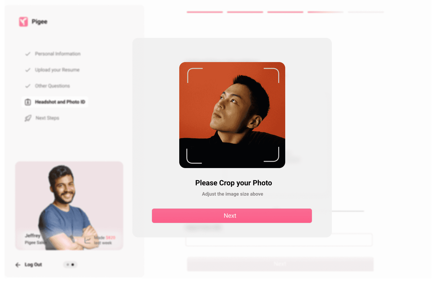
FINAL PRODUCT
FINAL PRODUCT
A Guided and Streamlined Sales Application Portal.
A Guided and Streamlined Sales Application Portal.

Clear Application Steps→
Clear Application Steps→
With a checklist of steps, users are able to easily understand the application process,
With a checklist of steps, users are able to easily understand the application process,
1

1
2

2

A More Straight Forward Process→
A More Straight Forward Process→
Due to the new portal’s design, applicants no longer had to jump between many different websites.
Due to the new portal’s design, applicants no longer had to jump between many different websites.
More Relevant Questions→
More Relevant Questions→
The application was streamlined by removing vague questions and adding new ones about location, experience, and technical proficiency to improve candidate selection.
The application was streamlined by removing vague questions and adding new ones about location, experience, and technical proficiency to improve candidate selection.
3
3
Results →
32% reduction in task completion time (5 minutes less with the new design)*.
Test applicants reported a 44% decrease in frustration (from 4.1/5 to 2.3/5)*.
All test users were able to find the essential job details within 30 seconds in the new design*.
*This data is based on 8 usability tests with prospective applicants and compared to 3 tests with the existing system.
Results →
5
minutes saved on the average application process based on 8 usability tests
Results →
5
minutes saved on the average application process based on 8 usability tests
Results →
5
minutes saved on the average application process based on 8 usability tests
Results →
5
minutes saved on the average application process based on 8 usability tests
Final Design Preview →
*Full prototype is under NDA
FINAL THOUGHTS
FINAL THOUGHTS
Key Learnings and Next Steps.
Key Learnings and Next Steps.
What I learned→
What I learned→
Through this project, I learned the importance of accounting for international user perspectives when designing an application process. Writing questions that considered different legal systems and cultural contexts for job applications pushed me to create a more thoughtful and inclusive flow. I also strengthened my collaboration skills, learning to communicate more clearly and balance trade-offs with team members.
Through this project, I learned the importance of accounting for international user perspectives when designing an application process. Writing questions that considered different legal systems and cultural contexts for job applications pushed me to create a more thoughtful and inclusive flow. I also strengthened my collaboration skills, learning to communicate more clearly and balance trade-offs with team members.
Next Steps →
The application portal should be tested with a wider international user base to validate its effectiveness across diverse contexts. Expanding language options will be crucial to making the portal more accessible to a wider range of applicants and supporting Pigee’s goal of recruiting a global sales team.
Thanks for visiting! I go into more detail on my work over calls/interviews. Feel free to reach me here.
Thanks for visiting! I go into more detail on my work over calls/interviews. Feel free to reach me here.
My Other Projects:
Another Project:


